


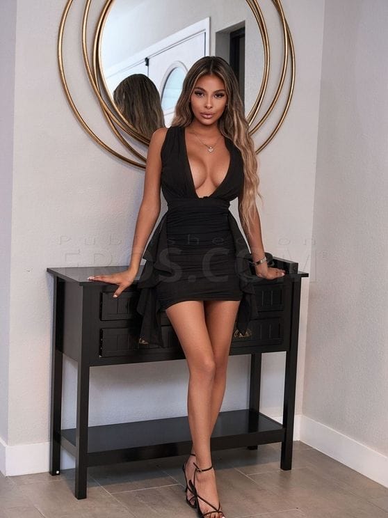
Brittany
Visiting July 22nd till July 29th Please prebook
Spicy Bombshell


Stella
I like to have fun and party


Alison
Visiting until August 6th, 2026
Im here to have fun

Nova
Your newest obsession.


Zacha
.


Isabela
.


Sofia
Hey love
I am a charming girl willing to please you and give you the best experience, contact me


Kloe
Sexy ,elegant and fun girl
Hi bby Im visiting the City ,exotic and accommodating ,ready to party


Stefani
Hey, let's party


Star
Hi


Natasha
Latina Sexy


All natural Amy
Blonde Girl Next Door of your Dreams


Devil
.


Daisy
Busty College Brunette


Sweet mia
I really like the party and spending quality time I have all the best for you I assure you
New girl in the city I like everything, just send me a message


Adult Film Star Ava Valentina
Where Fantasy Meets Reality


Juniper
The Girl You Dream About


Asian Jade Marie Kim
Visiting until August 7th, 2026
Your Favorite Korean Bombshell with Perfect Curves


Samantha
I HAVE A FRIEND HERE. LETS MAKE IT DOUBLE. 27/7 online. The woman youve been searching for.


Kelly
Hi there! I love to party and I make it better! Duo and couples welcome!


GINA
Hot Gina waiting you !


AsiaMei
Japanese Doll


Daniela
The Colombian of your dreams


Sky
Im here with European friends. Open for parties! Available 24/7.


Blair
Great personality, Beautiful face, Busty, Curvy Bombshell,


Monica Taylor
Hi Admirers, I will be visiting touring LA and very excited to meeting and getting together. I am sweet and extremly passionate women. I love forming a deep connection and great conversations. FaceTime verification available.
Vegas Model Visiting LA 6/5 6/14


Veronica H
Visiting until August 8th, 2026
Contact me to give you an unforgettable experience, I am a very sweet


Jade Skye
Natural beauty with a booty


Milagros
Milagros


Morgan Taylor
The seductive world of Morgan Taylor


Milly
Treat yourself, you deserve it. Petite & pretty. Always discreet, always fun


Olivia
FACE TIME VERIFICATION IM A REAL DUO ? INN CALL OUT CALL DINNER PACKAGES


Kitty
Willing to fulfil your best fantasies


Robin Pachino
Good Conversationalist


Lina
Im new here with friends! We like parties:) available 24/7!


Gabriela
Gabriela


Sophia
Wildly Feminine Mature Lovely Blonde


Chanel
Sexy girl who loves good company and parties
Sexy girl who loves good company and parties


Sinful Selena
Not for everyone just for you. ;) 100% independent and no drama


Valentina
If you try me, you won't forget me.
I'm exotic, do you dare? The best experience


Adult Film Star Jenesis Jade
Sweet & Unforgettable


Nikki
Classy with a wild side.


Ruby
Your exotic getaway


Scarlett
Temptation Has a Name


OLIVIA
Very good girl


Hailee
July 22nd till July 29th Please prebook if possible
Discreet, sophisticated and fun bombshell


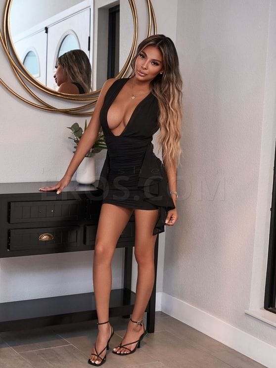
Hailee and Brittany
July 22nd till July 29th Please prebook
Sweet and Spicy


Cloe
.


Victoria
Sweet like candy, spicy like tequila


Alana Aubrey Amor
Hey Lover


MIA STORM
All we need is love

JADE
TEXT WITH AGE ,NAME, RACE!
COME PLAY ! SERIOUS INQUIRIES ONLY !


Alyna Banks
Your Fantasy Girl Next Door - Treat Yourself!


Jaylene Rio
busty and curvy Latina Porn Star


Kayci Marie
Come to me for a pleasant moment


Princess
Soft sensational Asian goddess


Kira In Studio City
In Studio City
U deserve it....


Stacy
Vibes with sinful energy


Addison
Sexy girl


Tanya Tate Adult Superstar
Los Angeles


Caro m
Beauty ,sexy Natural latina come true you dreams


Famous Jenna Bentley
Meet the Legend: Jenna Bentley 511 of Blonde Perfection with Captivating Blue-Green Eyes.


Cathalina
I really like the party
I like the party


Nikki Fox
The Hot Girl Next Door


Katy
Latina Sexy


Alina Swarovski westLA, SFV, OC, TO
Magic Euro cougar next door..


Susanna
*Im in Beverly Hills *Happy, Healthy & Nice :) *Call/ text anytime

T.o.M.o.M.i
TOP rated provider, Asian, Intelligent, sophisticated, Elegant, Sensual, seductive


Adult Star Cici Queen of Hell
Built for Your Wildest Dreams


Armani Black Adult Super Star
Adult Super Star Armani Black Exclusively Through Lourdes


Daisy
Sweet. Sexy. Addictive.


Arya
Cute, classy, and captivating.


Anastasia
Charming, enticing, and twice the delight ask about our duo experiences!


pornstar sydney cole
in la til aug
in la


Alora Vale
Middle Eastern Delight


Veronica Wilder
Petite perfection wrapped in silk, sin, and sweet rebellion.


Alicia
The fantasy youve been craving


Hade
.


Grace
Hi Im Real, Duo with my friend, couples welcome. If you need me, Id love to party


Diamond
An unforgettable experience awaits you


Mia
Your sweetest distraction


Nikki
Baddie Nikki


Sunshine
Your fav snowbunny


Gina Rollins
Highly Reviewed- I Know How to Make You Happy


Vivienne
Available 24/7, real photos, ready to party give me a call


Ally
Visiting until July 31st, 2026
Sweet little treat


Natalia Belle VIP
exotic colombiana


Kamy
Let's party available 24/7


Sofia
Hey, let's party


Roxy
I am open minded and funny girl. You will be definitely happy with me


Nurana
Russian Goddest


Magicmaisy
Busty college redhead
Who Are the Most Relevant Profiles for Women in Los Angeles, California?
Large city catalogs often include separate sections designed for different browsing preferences. One of these sections is the category of profiles oriented toward women in Los Angeles. Many open the general page and start scrolling through everything. But over time, it becomes clear that some sections are created much more thoughtfully. This is exactly what the category of profiles oriented toward women in Los Angeles looks like.
In a large city with a diverse audience, the catalog's structure matters. When profiles are gathered in a separate section, browsing becomes more predictable. A person doesn’t waste time on pages that don’t match what they’re looking for. Instead, there’s an opportunity to view profiles that are immediately presented in the right context.
When you open a dozen ads in a row, the difference starts to stand out. Some profiles look short and almost empty, while others create the feeling of a well-thought-out page. This doesn’t always mean there’s a lot of text. Sometimes, a few clear paragraphs are enough for a profile to appear more put?together.
From a user’s perspective, this looks quite simple. You open the category page, see a list of ads, and gradually browse them one by one. After a few minutes,differences between profiles start to become clear. Some look more thoughtful: there’s a clear description, a logical order of photographs, and no sense of a random collection of information.
How Should Users Compare Profiles for Women in Los Angeles, California?
When you open several profiles in a row, the same problem arises very quickly: all the pages start to seem similar. That’s why experienced users rarely browse profiles chaotically. Over time, a simple habit forms — evaluating a page by a few clear signals.
First of all, attention is paid to how complete the profile looks. If the page has a short but logical description and a clear structure, it’s much easier to browse. Another important thing is the sense of relevance. When a profile looks updated, this becomes clear even without special marks.
For clarity, this approach to browsing is often shown as a simple comparison table:
|
Comparison factor |
What users check |
Why it matters |
|
Profile detail |
How clear is the information provided |
Helps make a first impression |
|
Recent activity |
Signs that the page has been updated |
Shows that the profile is still active |
|
Image consistency |
Do the photos look like a series |
Makes the page more cohesive |
|
Visible badges |
Presence of tags or statuses |
Gives additional signals of verification when browsing |
When you look at profiles this way, browsing stops being random. Pages become easier to compare, and the differences between them become much clearer even after a few minutes of viewing.
What Profile Features Help When Browsing Profiles for Women in Los Angeles, California?
After viewing several pages in a row, you look at profiles a little differently. At first, attention falls on photographs or the overall look of the page, but after a while, you begin to see elements that might have slipped by earlier. These small things often help to understand how well the profile is designed.
For example, much depends on how the description itself is written. If the text feels natural and reads effortlessly, the page is perceived much more easily. When the description is overly long or appears too chaotic, users usually don’t spend much time reading it. In a large catalog, people quickly move on.
The order of information also plays an important role. In well-designed profiles, key details are where you’d expect to find them. A person doesn’t have to search for essential information all over the page. Such profiles read almost intuitively.
Experienced users also pay attention to one more signal — the sense of transparency of the page. When a profile looks logical and without unnecessary embellishment, it inspires more trust. In such ads, information isn’t hidden behind complicated wording but is presented simply and directly.
Ultimately, it’s the combination of these details that shapes the page's overall impression. Clear text, a logical arrangement of information, and a neat structure make the profile more pleasant to view, even in a large catalog.
Why Choose Eros Profiles for Women in Los Angeles, California, for Category-Specific Browsing?
If you look at different sites with similar catalogs, the difference between them becomes noticeable quite quickly. On some platforms, profiles appear scattered without any particular logic, and browsing turns into a long search among random pages. Other resources organize the information better.Moderated listings also help maintain a more consistent structure across profiles, which makes browsing categories more predictable.
This is where the difference is felt when you open a category on Eros. Pages don’t look like a random collection of profiles. They are arranged so that the user can calmly browse them one after another without a sense of chaos.
When a category is built logically, people spend less time on navigation itself. There’s no need to constantly go back or open dozens of new tabs to understand where you are in the catalog. You enter the right section and start browsing profiles in a clear order. Pages have a similar structure, making it much easier to compare them.
A similar pattern appears when a person spends more time on the platform. At first, browsing looks like a simple scroll through pages, but over time, the user begins to navigate the site’s structure almost intuitively.
When categories are clearly organized, people easily return to profiles they’ve seen before. This creates a sense of a familiar space where you don’t have to figure out the navigation all over again each time.
In well-organized catalogs, like Eros, even a large number of pages doesn’t feel overloaded. The user moves between profiles calmly, without chaotic transitions. It is this predictability that makes the platform more convenient for longer browsing.
As a result, the browsing process itself feels calmer. There’s no sense of getting lost among hundreds of ads. The category reads as a cohesive list, with each page looking like part of one system. That’s why many users prefer platforms where the catalog appears orderly and doesn’t create unnecessary confusion.
Adults Only!